Create a WooCommerce Store Design Kit in Theme Assistant
Use Theme Assistant to gather tokens, page patterns, product-card styling, checkout cues, and reusable CSS guidance for a WooCommerce design kit.
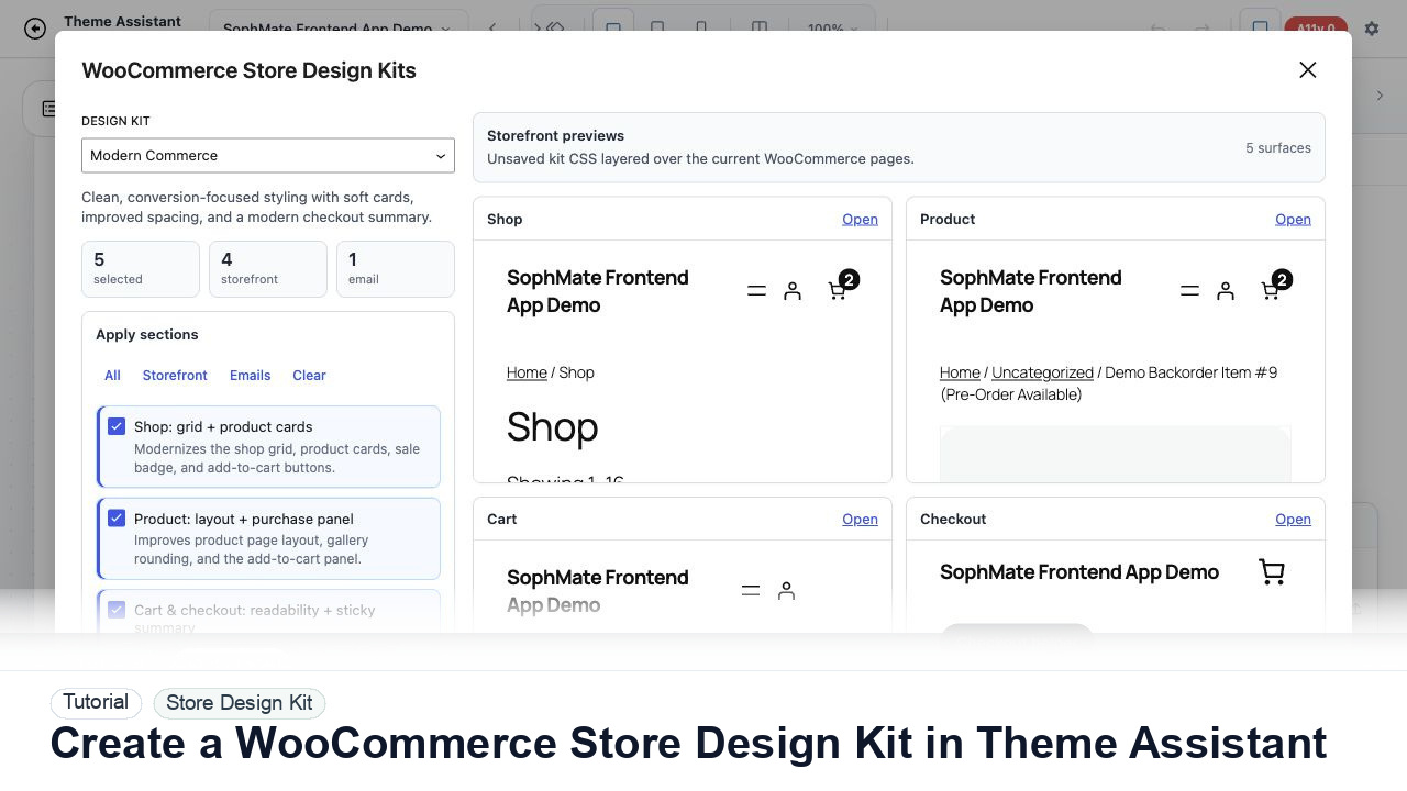
Use Theme Assistant to gather tokens, page patterns, product-card styling, checkout cues, and reusable CSS guidance for a WooCommerce design kit.
By the end of this tutorial, you will know how to use SophMate for WooCommerce design kit while keeping the work reviewable inside WordPress.
An agency wants consistent product cards, buttons, spacing, and checkout helper styling across a client WooCommerce store.
Use this tutorial to evaluate whether SophMate can support client-facing design work without hiding production risk. Buyers should look for target components, selector scope, responsive checks, accessibility review, CSS history, and rollback behavior.
Propose a scoped Theme Assistant change for this page. Name the target component, selector risk, responsive checks, accessibility concerns, CSS history label, and rollback path before publishing.
The tutorial image shows Theme Assistant context: live preview, design controls, responsive review, and presentation-oriented workflow areas for visual changes.
Use scoped CSS, responsive checks, accessibility review, and history notes before publishing visual changes.
Include homepage, shop archive, product detail, cart, checkout, and account pages. A design kit based only on the homepage misses commerce states.
Use the Tokens panel to record colors, typography, spacing, radius, and component patterns already used by the theme.
Have Theme Assistant propose product-card, button, notice, and checkout helper rules that fit the existing theme rather than replacing it.
Apply draft CSS to product lists, single products, cart, checkout, and account areas in preview. Check product sale badges and empty states.
Turn the design kit into a client explanation: what changed, where it applies, and what should not be edited manually.
The Theme Assistant workflow is successful when the change is scoped, reviewed at key breakpoints, accessibility concerns are documented, and the team can revert or explain the CSS history.
If visual output harms layout, accessibility, or checkout-adjacent states, revert the named CSS change from history and keep the module paused until the affected pages are rechecked.
Document target page, selector or component family, desktop/tablet/mobile checks, accessibility notes, CSS history label, and approval status.
A designer owns visual intent, while the site owner or developer owns production impact. Review every meaningful CSS change before publishing.
Escalate when CSS affects checkout, account, accessibility, mobile navigation, or theme structure beyond the intended visual scope.
Do not publish from one preview alone. Check mobile, desktop, logged-out state, accessibility, cache behavior, checkout/account impact, and rollback history first.
No. SophMate should make the work easier to draft, inspect, approve, and repeat. Human review remains necessary when output affects customers, money, published content, privacy, settings, or workflow execution.
Record the owner, input scope, access boundary, approval point, failure modes tested, evidence location, monitoring window, and rollback or stop path.
Save one scoped draft with desktop, mobile, accessibility, cache, and rollback notes before asking a client or site owner to approve the visual change.
Next step
Review the SophMate listing for current package details, screenshots, compatibility notes, and license terms.
Related
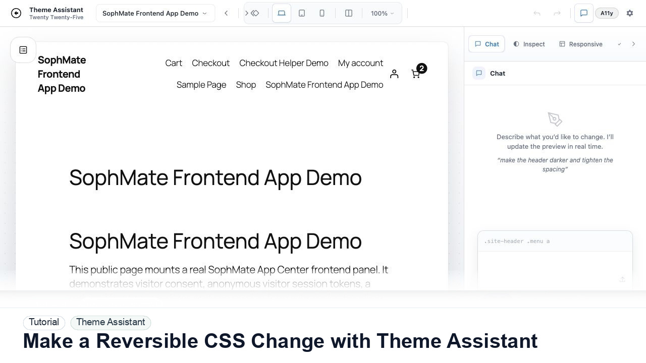
Use Theme Assistant to request a CSS refinement, inspect the preview, review generated CSS, and keep the change reversible through history.
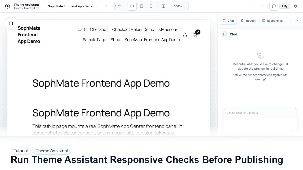
Switch Theme Assistant between desktop, tablet, and mobile views to catch spacing, navigation, overflow, and CTA issues before publishing CSS.
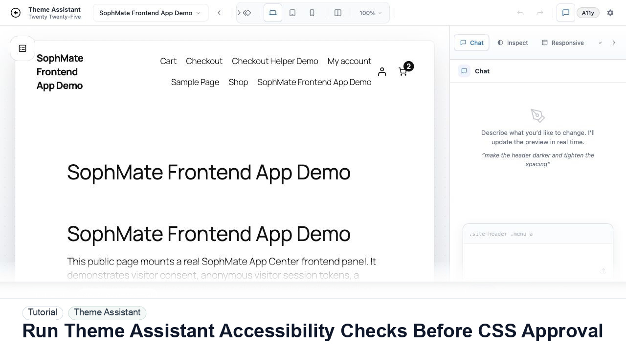
Use Theme Assistant accessibility checks to review contrast, hierarchy, spacing, and tap-target concerns before approving AI-generated CSS.